5 Common Design Mistakes That Make Your Brand Look Unprofessional

Your brand's visual identity is very often the first interaction potential customers have with your business. A professional design can attract and retain customers, while common design mistakes can severely damage your brand's credibility. In this article we’ll explore five major design mistakes that can make your brand look unprofessional and we’ll provide practical advice on how to avoid them.

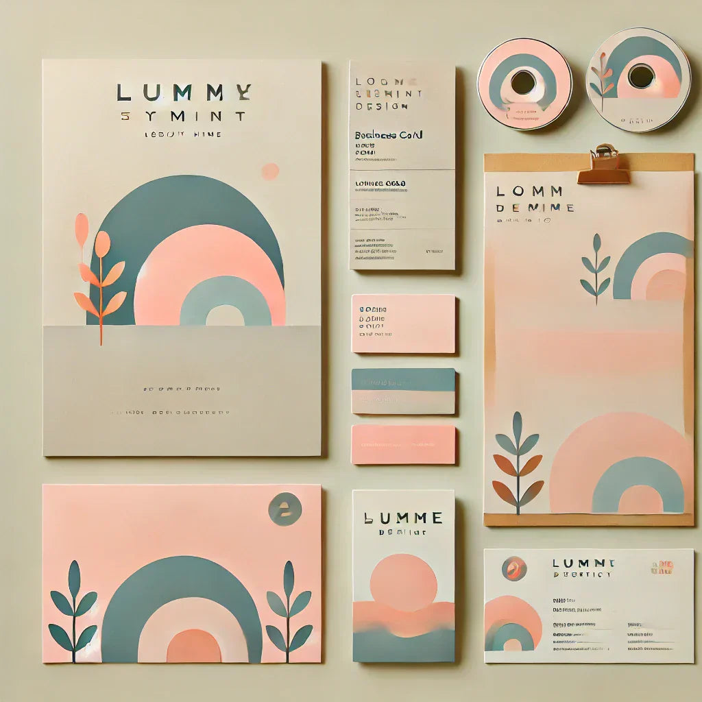
Mistake #1: Inconsistent Branding Across Platforms
Definition and Impact
Inconsistent branding occurs when your business’s visual identity displays variations inside the same platform, like your website, social media and other platforms, leading to a confused brand experience. This inconsistency can occur in several ways, such as using different logos, divergent color schemes, or differing font styles across your digital presence and your physical marketing materials such as business cards, presentations and brochures. Those discrepancies in branding can lead to confusion among potential customers, making it challenging for them to identify and connect with your brand.
Over time, this lack of a cohesive brand image can decrease trust and diminish brand loyalty, as customers might perceive the brand as disorganized or unreliable. This is even more important if you are working in the graphic design industry. Establishing a consistent brand identity is crucial and reinforces brand recognition, enhances customer loyalty, and builds a strong image that customers can trust and associate with quality and professionalism in all interactions with the business.
Real-World Examples
Imagine a local café that adopts a sleek, contemporary logo on its website to appeal to a younger, trend-conscious demographic. However, this café uses an older, more traditional logo on its physical marketing materials, such as business cards and flyers. This inconsistency can lead to confusion and disconnect for customers, who might struggle to reconcile the modern, vibrant online presence with the outdated and conservative offline presence. As customers interact with the café's varied branding, they may question whether they are dealing with a single, cohesive entity or two separate businesses. This confusion can decrease trust and professional credibility, potentially deterring a segment of the clients who value consistency and modernity in the brands they support. Moreover, inconsistent messages might lead to a fragmented market perception, affecting overall customer engagement and loyalty.

Avoiding Inconsistency
To maintain a consistent brand:
✅ Develop a comprehensive brand guideline that outlines your logo usage, color palette, typography, and image selection.
✅ Regularly review all your platforms to ensure they are aligned with your brand guidelines.
✅ Train your team on the importance of brand consistency across all platforms.
Apply those tips to your business industry and you’ll start seeing results like more engagement with your brand when promoting it online and offline! If you don’t know where to start, my “Design for Non-Designers - Beginner-Friendly Guide” may help you to get started, as it guides you through the foundational principles of good design, like typography, contrast, alignment, and spacing.!
Mistake #2: Overcomplicating Design Elements

Simplicity vs. Complexity
A frequent mistake among non-designers is the tendency to overcomplicate design elements. In the search to stand a brand's personality, there's often a temptation to integrate multiple colors, numerous font styles, and a variety of images within a single design. While diversity in design elements can sometimes enhance a message, very often, this leads to a chaotic visual presentation. Such complexity can overwhelm the viewer and mask the core message that the design intended to communicate. When the visual space is saturated with competing elements, the viewer's ability to process and retain the message is significantly reduced. Instead of attracting and holding the audience’s attention, complex design can create confusion, causing potential customers to disengage. This can be particularly detrimental in marketing materials or digital content where capturing and maintaining viewer attention is paramount. Effective design should aim for clarity and cohesion, where each element serves a clear purpose and complements the overall message.

Tips for Simplification
To simplify your designs effectively:
✅ Limit your design to 2-3 colors that reflects your brand’s personality and are visually harmonious. If you need help choosing colors that combine, I personally use coolors.co website. They don’t ask for sign in or any payment, and give you a full color palette where you can create multiple combinations to see what works best for your brand or business.
✅ Choose one primary typeface for headlines and another for body text, ensuring they complement each other. There are several offers world wide, free and licenced fonts. I like to opt for fonts that have less risk of going wrong and present problems when installing on your Apps/programs. Be aware about special characters as well, depending on your computer keyboard and language you’re using. Certify that the font you choose has the special characters you need so you don’t have any issues during your brand creation process.
✅ Use high-quality images to support your content rather than overshadow it. If possible you should use your own images and photos so you don’t have to worry about using the same material as other companies, especially in the same industry as you are. Although, if you struggle with low-quality images, there are plenty of stock images websites that can help you improve your brand image. I use Freepik, Unsplash, Pexels, Pixabay and few others. All have free stock images and premium. Choose what works best for you.

Benefits of Minimalist Design
Embracing a minimalist approach in graphic design can significantly elevate the professionalism of your visual content while enhancing the user experience, making it a great strategy for small business owners and non-designers learning graphic design. Minimalism focuses on the essentials, clear away non-essential elements to prevent visual disarrangement. This design philosophy prioritizes clean lines, a limited color palette, and ample whitespace, which helps highlight the most important information such as branding tips for small business owners and easy tips for your customers. By reducing distractions, minimalist design makes it easier for viewers to focus on key messages and follow calls to action without getting lost in excessive details. This ease of navigation not only engages users more effectively but also facilitates quicker understanding and decision-making.
In environments where consumers are bombed with information, a minimalist approach can make your content stand out as an oasis of simplicity and elegance, which is crucial for anyone looking to learn graphic design from scratch or enhance their social media graphics professionally. Furthermore, minimalist designs are often more adaptable across different platforms and devices, ensuring a consistent and cohesive brand experience that resonates with a broad audience. This adaptability is especially important in a digital landscape where responsiveness and scalability across devices are essential for maintaining user engagement and satisfaction.

Mistake #3: Poor Typography Choices
Understanding Typography Fundamentals
Typography is a foundation of graphic design for beginners and seasoned professionals alike, playing a crucial role in effectively conveying a brand's voice and tone. Selecting the right typography is crucial for any digital design for beginners, as it can significantly draw readers in and enhance the readability of your content, making it more enjoyable and engaging. Poor typography choices, such as using hard-to-read fonts or excessive variation in type styles, can be severely off-putting. This can make your content difficult to digest, detracting from the user experience and potentially harming your brand's professional image.
Learning graphic design fundamentals, including mastering typography, is essential for non-designers and content creators who wish to create professional-looking social media graphics or branding materials without relying on complex software like Photoshop. Effective typography should align with the overall design aesthetic and support the communication objectives, ensuring that text is not only visually appealing but also functional and accessible to all users. If you want to go deeper on this matter, you may find my “Design for Non-Designers - Beginner-Friendly Guide” useful where I explain exactly how you can select and combine fonts together.
Common Typography Errors
One of the most common mistakes in freelance graphic design for beginners is the misuse of typography. Key typography errors often include using too many typefaces, employing fonts that are difficult to read, and neglecting text hierarchy, each of which can significantly undermine the professionalism of your designs. For non-designers and digital product creators, understanding these mistakes is crucial. Overloading a design with multiple typefaces can create a disorganised and confusing visual experience, while selecting hard-to-read fonts can deter users from engaging with your content, particularly on digital platforms like social media where readability is paramount.
Additionally, a lack of proper text hierarchy fails to guide the reader's eye through the content effectively, making essential information hard to find and follow. These errors are particularly detrimental for small business owners and content creators who rely on clear, impactful communication to capture and retain their audience’s attention. Learning basic graphic design principles, such as effective typography, can greatly enhance the quality of your digital designs, making them more attractive and accessible to users.
Selecting the Right Fonts
To choose effective typography:
✅ Opt for readability over style; avoid overly decorative fonts for body text. One very good tool to find fonts compatible worldwide is Google Fonts. I use it a lot and the good news is that they are free to use!
✅ Establish a clear hierarchy using different sizes, weights, and styles to guide the reader’s attention. If you choose two fonts that are too similar, wont make sense in the overall aesthetic. Opt for 2, maximum 3 fonts, that transmit different feelings, perception and hierarchy.
✅ Consider the context and audience—what works for a trendy social media post may not be suitable for a corporate report. When creating content for social media, you want to grab attention, while a corporate report should be more formal and with a corporate layout, including a responsive table of contents for easy navigation through the document.
Mistake #4: Ignoring Mobile Optimization

Mobile First Approach
In an era where mobile devices increasingly dominate internet access, adopting a mobile-first approach in your design strategy is more crucial than ever. For small business owners, digital marketers, and content creators, ensuring that websites and social media graphics are optimized for mobile screens is essential. A lack of mobile optimization can significantly hurt your brand's online presence, as poorly adjusted elements and challenging navigation can appear unprofessional and deter user engagement.
Optimizing for mobile involves designing with the constraints and capabilities of mobile devices in mind from the outset, rather than adjusting desktop designs to fit smaller screens. This strategy ensures that all users, regardless of the device they use to access your content, experience functionality and aesthetics that reflect the professionalism of your brand. For those learning graphic design, understanding how to create beautiful designs without Photoshop and ensuring these designs translate well on mobile platforms can drastically improve user interaction and satisfaction.
I strongly advise you to test before you publish. Why? When working on a computer, information looks bigger that actually will be when seen on your mobile. When finishing your design, open it on your smartphone, take a look at readability and hierarchy, and make any adjustments if needed.
Making Design Mobile-Friendly
Key strategies to ensure mobile optimization include:
✅ Using responsive design techniques so your website adjusts seamlessly across different screen sizes.
✅ Prioritizing loading speed and interactive elements to enhance the mobile user experience.
✅ Testing your designs on various devices to ensure they look and function as intended.
Mistake #5: Using Low-Quality Images and Graphics

The Impact of Visual Quality
The quality of the visuals you use is a direct reflection of your brand’s professionalism and attention to detail. For small business owners, content creators, and digital marketers, employing high-quality images and graphics is essential to establishing and maintaining credibility. High-resolution, well-composed visuals can significantly enhance your brand's appeal and demonstrate your commitment to quality, which can convert more viewers into loyal customers.
Low-quality images and graphics can severely undermine your brand image, suggesting a lack of care or investment in your offerings. In the digital age, where visual content dominates consumer interaction, ensuring that all graphics—from social media posts to product listings on platforms like Etsy—are of the highest quality is crucial. This not only boosts engagement but also enhances user experience, making your content more shareable and increasing your online visibility. For those looking to learn graphic design, focusing on creating and sourcing quality visuals can be a game-changer in how your brand is perceived across digital platforms.

Sources for High-Quality Images
Reliable sources for high-quality visuals:
✅ Stock photography websites like Unsplash and Shutterstock for professional photos.
✅ Tools like Canva and Adobe Spark that offer built-in high-resolution images and design elements.
Enhancing Image Quality
Practical tips for improving image quality in your designs:
✅ Improving the quality of images in your designs is crucial for creating visually appealing and professional-looking content. Here are some practical steps to enhance image quality that go beyond the basics:
-
Master Basic Photo Editing Skills: Start by learning how to adjust key elements like color balance, contrast, and sharpness. Tools like Adobe Lightroom or Photoshop offer user-friendly interfaces for beginners to tweak these settings effectively. Adjusting the color balance can help your images look more natural or vibrant, depending on the desired effect. Enhancing contrast can make your images pop and give depth to your photos, while adjusting sharpness can help clarify details that make your images look more polished. If you don’t want to go with paid tools, Canva has few options on color correction.
-
Use High-Resolution Images: Always start with the highest resolution images possible. This prevents loss of quality when resizing or editing. For digital designs, aim for images that are at least 1920 pixels on the longest side for standard displays, and higher for print or large-format displays.
-
Use Advanced Techniques Like Layer Masks and Blending Modes: As you become more comfortable with basic adjustments, explore more advanced techniques in photo editing software. Layer masks allow you to apply changes to specific parts of an image without affecting the whole picture, offering you finer control over the editing process. Blending modes can be used to combine layers in different ways, creating dynamic effects that can enhance the visual impact of your images.
-
Utilize Image Enhancement Software: Consider using software specifically designed for image enhancement. Tools like Pica-ai.com, Topaz Labs’ AI Gigapixel can upscale images while maintaining quality, and AI tools like Adobe’s Sensei can automatically suggest improvements and apply them to your photos.
-
Calibrate Your Monitor: Ensure that your monitor is correctly calibrated so that the colors and brightness you see are true to how they will appear on other screens or in print.
-
Participate in Workshops and Tutorials: Continuously improve your skills by attending workshops or following online tutorials. Many professional photographers and graphic designers share their expertise through platforms like YouTube, offering insights into more nuanced aspects of photo editing.
By implementing these techniques, you can significantly improve the quality of the images used in your designs, ensuring they look sharp, clear, and visually compelling. This not only enhances the aesthetic appeal of your projects but also reinforces your brand's professionalism and attention to detail.

✅ Ensure Correct Image Resolution for Intended Use
Maintaining the correct image resolution is crucial for producing clear, sharp images in your designs, which helps prevent pixelation or blurring that can detract from the professionalism of your work. Here are some detailed steps and tips to help you manage image resolution effectively:
-
Understand Resolution Requirements: Different mediums require different resolutions. For web use, images should typically be 72 DPI (dots per inch), while print materials generally require a higher resolution of at least 300 DPI for clear output. Familiarize yourself with the specific requirements of each medium to ensure optimal clarity.
-
Check Image Size Before Use: Before incorporating an image into your design, check its original size and resolution. Use tools like Adobe Photoshop or GIMP to view and adjust these properties. If an image’s resolution is too low for its intended use, consider sourcing a higher-resolution version or choosing an alternative image to avoid quality issues. In the beginning of this article I gave a few options on this.
-
Resize Images Properly: When resizing images, use image editing software that allows you to adjust resolution settings while resizing. Ensure you maintain the aspect ratio to avoid distorting the image. Programs like Photoshop provide a ‘Resample’ feature, which helps in adjusting the pixels during resizing, ensuring the image does not lose clarity.
-
Use Vector Graphics Where Possible: For designs that will be used across various sizes, consider using vector graphics. Unlike raster images, vectors are not made up of pixels but paths, which allows them to scale up or down without losing quality. This is especially useful for logos and other branding materials.
-
Test on Actual Devices or Outputs: After adjusting your image, test how it appears on the actual device or output medium where it will be used. This could mean viewing it on different screens, printing a sample, or using digital proofs. This testing helps ensure that the image appears clear and undistorted in its final form.
-
Educate Yourself on Image Formats: Different image formats may be better suited for different uses due to how they handle compression and quality. For example, JPEGs are typically used for photographs on the web due to their compression capabilities, while TIFFs are better for high-quality print output because they do not lose quality with compression. Remember, never share your original working image with all the layers open for others to see! Always convert to jpg or png for sharing.
By following these guidelines, you can ensure that your images are always the right resolution for their intended use, thereby enhancing the overall quality and effectiveness of your designs. This attention to detail is crucial in maintaining a professional look and feel in all your visual communications.
Frequently Asked Questions
-
What is the best graphic design software for beginners?
-
For individuals new to graphic design, choosing the right software can make a significant difference in their learning curve and overall design quality. Canva is highly recommended for beginners due to its user-friendly interface, vast array of templates, and extensive library of design elements that make it accessible even for those without any design background. It's an excellent tool for creating social media graphics, posters, and basic branding materials.
-
Another great option is Adobe Spark, which offers similar features to Canva but with the added advantage of integration into the Adobe ecosystem, making it a good choice for those who might want to advance to more complex Adobe tools like Photoshop or Illustrator as they gain confidence and skills.
-
For those interested in vector graphics, which are essential for creating logos and scalable designs, Vectr is a user-friendly option with a gentle learning curve. It offers a free platform that can be used directly in your web browser, eliminating the need for powerful hardware.
-
Gravit Designer is another beginner-friendly tool that provides more advanced features for creating detailed vector illustrations and layout designs. It's available both as a desktop application and in-browser, making it versatile and accessible for beginners eager to explore different aspects of graphic design.
-
Pixlr provides a robust suite of imaging tools that mimic much of Photoshop's capabilities but with less complexity, ideal for beginners who want to venture into photo editing without the steep learning curve associated with more advanced software.
-
These tools offer a range of functionalities and learning resources that can help beginners start their graphic design journey, allowing them to create professional-looking designs with minimal prior experience. Whether you're looking to design simple graphics for social media or more complex projects like website layouts, these platforms provide the necessary tools to get started on the right foot.
-
How often should I update my brand’s design?
-
Refreshing your brand’s design periodically is crucial to maintaining its relevance and appeal in a rapidly changing market. For small business owners, it is advisable to consider updating your brand design every 2-3 years. This timeline can help keep your visual identity fresh and engaging, which is essential for sustaining consumer interest and standing out in competitive industries.
-
These updates might involve refining your logo, updating your color palette, or introducing new design elements that reflect current trends without losing the essence of your brand identity. This process is an opportunity to incorporate easy design tips for non-designers and apply branding tips for small business owners, ensuring that even without extensive graphic design skills, you can still make your social media graphics look professional and create beautiful designs without relying on complex software like Photoshop.
-
Regular design updates are also an excellent time to reassess how your brand is perceived by your audience. Gathering feedback can provide insights into what design elements resonate well and what might need adjustment. This feedback-oriented approach ensures that your design updates not only keep your brand modern and relevant but also closely aligned with the evolving preferences of your target audience.
-
Updating your brand design is not just about aesthetics; it's also a strategic move to ensure your business adapts to new market conditions and technologies, enhancing your overall brand strategy. Whether you’re designing for non-designers or experienced creatives, keeping your branding updated is key to continuous engagement and success.
-
Can I use different logos for different products?
-
For entrepreneurs and freelance graphic designers for beginners, it's not uncommon to consider using different logos to distinguish between various product lines. While this approach can effectively target specific market segments, it's crucial to maintain a strong overarching brand cohesion to avoid customer confusion.
-
When managing multiple logos, ensure that each one reflects a consistent brand narrative. This could mean using a uniform color scheme, typographic style, or design elements across all logos. This strategy helps reinforce brand recognition and loyalty, even when you introduce variations tailored to specific products.
-
For those just starting out or looking to learn basic graphic design, it's important to understand that brand cohesion extends beyond logos. Every aspect of your visual branding should communicate a unified message. This includes your choice of imagery, language, and overall marketing materials. Consider resources like “Graphic Design for Dummies” or similar beginner-friendly guides to get foundational insights into creating a cohesive branding strategy.
-
Adopting a strategic approach to logo design, especially in the context of graphic design for beginners, ensures that even if your logos vary, they still resonate with the core values and aesthetics of your main brand. This method not only prevents confusion among your target audience but also strengthens your overall brand presence in a competitive market.
Conclusion
Avoiding the five common design mistakes outlined in this article is crucial for enhancing your brand’s professional appearance and improving your overall communication strategy. By ensuring consistency across all platforms, simplifying design elements, making informed typography choices, optimizing for mobile users, and using high-quality images and graphics, you can significantly elevate your brand’s impact and appeal.
To maintain this heightened level of professionalism, it is essential to conduct regular reviews and updates to your design strategy. Establishing and adhering to clear brand guidelines will help keep your visual identity cohesive and aligned with your brand’s values and goals. Additionally, actively seeking and incorporating feedback from your target audience can provide invaluable insights into how your designs are perceived and what improvements can be made to better meet their needs.
Moreover, staying informed about the latest trends and best practices in graphic design can further refine your approach, ensuring your brand not only maintains its competitive edge but also resonates with current and prospective customers in meaningful ways. Whether you are a small business owner, a content creator, or a digital marketer, embracing these principles will not only prevent common pitfalls but also foster a strong, recognizable brand that stands out in today’s crowded marketplace.
This commitment to quality and consistency in design demonstrates to your audience that your brand is trustworthy and dedicated to excellence, key factors that can convert first-time viewers into loyal customers. By prioritizing good design practices, you're not just selling a product or service; you're building a brand legacy that values quality and customer satisfaction above all.
Ready to start your graphic design journey? I wrote an ebook with the principles and best practices on how to create higher quality content. If you would like to get started and have no clue where to start, you can find my ebook HERE (beginner-Friendly guide Part 1) to help you get started. You will also have access to a few Canva templates you can use to improve your graphic design content.
Thanks for reaching this far! I hope this article helped you and, if you have any questions or want to read more about other similar topics, let me know in the comments.
Cheers!